
How Strategic Website Architecture Helped One Business Serve Two Distinct Audiences
Website Redesign • Squarespace • Website Strategy • Brand Styling • Service Positioning • User Experience
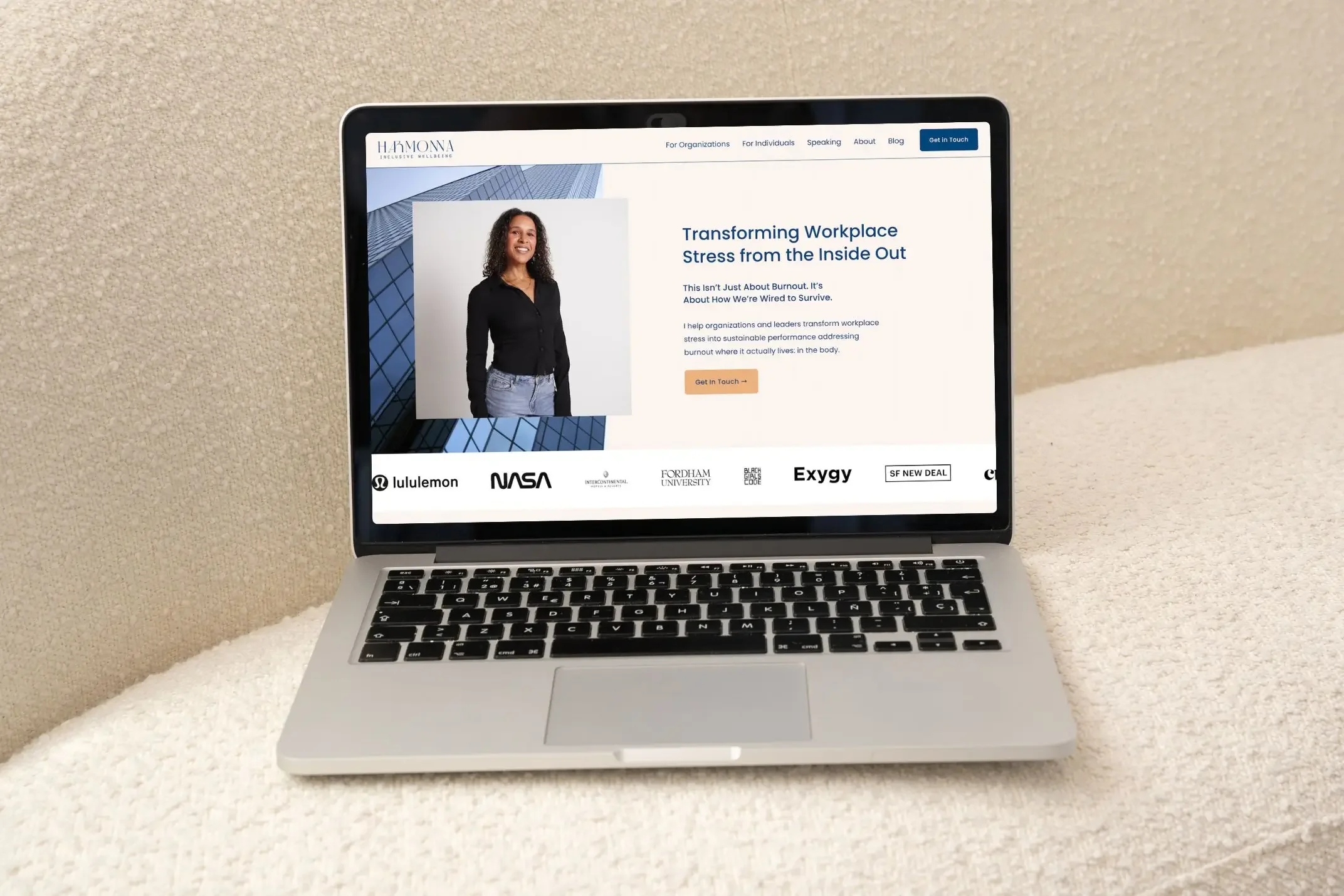
When your business evolves, your website should evolve with it.
When Lauren, the Founder of Harmonna Inclusive Wellness, first reached out, she had already built a website herself, and it had done exactly what it needed to do in those early stages: It gave her an online presence, helped establish credibility, and allowed her business to grow. But over time, something stopped feeling right.
She couldn't point to one specific problem, she just knew things weren't clicking anymore.
The website no longer reflected the quality of her work, the direction of her business, or the experience she wanted people to have when they landed on it. More importantly, it wasn't helping visitors understand where they fit.
As her business grew, so did the number of ways people discovered her. Organizational leaders were looking for support around burnout, communication, and leadership performance. Individual clients wanted help recovering from chronic stress and learning to regulate their nervous systems. Event organizers were searching for an experienced speaker who could bring these conversations into their organizations.
All three audiences were arriving on the same website with completely different questions.
The information they needed was there, but it wasn't organized around how people naturally think or make decisions. Visitors had to sort through content that wasn't meant for them before they could find what was.
That may sound like a small problem, but it has a ripple effect. When people have to work too hard to understand whether they're in the right place, they often leave before they ever discover the value you offer.
This project was about bringing clarity to a business that had evolved, creating a website that reflected where Harmonna is today while giving each visitor a clearer path forward.
About Harmonna
Harmonna’s work centers around nervous system regulation, helping people recognize how chronic stress affects the way they communicate, make decisions, collaborate, and lead. While those ideas are grounded in neuroscience and trauma informed practice, Lauren’s work has always been about something much more practical. She helps people perform at a high level without sacrificing their wellbeing in the process.
Today, Harmonna partners with organizations through leadership development, workshops, consulting, and speaking engagements while also supporting individuals through coaching and educational programs.
That combination is one of the business's greatest strengths - it also created the website's biggest challenge.
Although every service shared the same philosophy, the people looking for them were arriving with very different goals. A director of people operations evaluating a leadership workshop doesn't approach a website the same way someone searching for 1:1 coaching does. An event organizer booking a keynote presentation has an entirely different set of questions.
The website needed to acknowledge those differences without making the business feel fragmented.
The Challenge
One of the biggest misconceptions about website redesigns is that they begin with design. In reality, they must begin with the foundations: business clarity.
Before opening Squarespace or thinking about layouts, I wanted to understand how Harmonna had evolved, where Lauren wanted to take the business next, and how people were finding her in the first place.
As we stepped back, a clear pattern emerged. The real issue was that the website had become responsible for serving multiple customer journeys without ever being intentionally designed to do so.
Everything lived together because the business had grown organically over time. New services were added as new opportunities emerged, but the website never paused to reorganize itself around those changes.
That's something I see often with growing service businesses.
A website that worked beautifully in year one starts carrying the weight of a much larger business by year five. New offers, speaking engagements, digital products, consulting services, and resources are layered onto an existing foundation until visitors are expected to connect the dots themselves.
The website had outgrown the foundations it was built on.
Lauren needed a website that reflected the way her business had naturally evolved.
Looking Beyond the Website
One thing I remind clients of often is that websites more often have business challenges that happen to show up on a website.
If a business serves multiple audiences, the website should be organized around that.
If the way people buy has changed, the customer journey should change too.
If new services have become a meaningful part of the business, they deserve more than being listed on an existing page because there's nowhere else to put them.
Those conversations shaped every decision we made.
Rather than beginning with page layouts, we started by mapping the business itself.
Who are the primary audiences?
What questions does each person arrive with?
What information helps them feel confident moving forward?
What doesn't belong in front of them yet?
Answering those questions made the rest of the project significantly smoother because were were designing experiences around the people using the website.
That shift in perspective became the foundation for everything that followed.
Behind the Strategy
One of the first decisions we made had nothing to do with colors, typography, or imagery - it was deciding that not every visitor should have the same experience.
Instead of asking organizations, individual coaching clients, and event organizers to navigate one generalized website, we organized the entire experience around who they were from the moment they arrived.
That meant creating dedicated pathways for each audience, rather than expecting visitors to filter the content themselves:
Organizations were introduced to Harmonna through the lens of leadership development, communication, burnout prevention, and workplace performance. The messaging focused on the outcomes organizational leaders care about while making it easier to explore workshops, consulting, and long term partnerships.
Individuals entered a completely different journey. Their experience centered around burnout recovery, nervous system regulation, coaching, and reconnecting with themselves after spending years pushing through chronic stress.
Because speaking had become such an important part of Lauren's business, we also created a dedicated page that positioned it as its own offering rather than a short section buried within the website. Event organizers could immediately explore keynote topics, learn about Lauren's approach, review past collaborations, and submit an inquiry tailored specifically to speaking engagements.
None of those decisions were made because more pages are inherently better, they were made because every visitor deserves to feel like the website was built with them in mind.
Once that foundation was in place, every other decision became clearer. The navigation felt more intuitive, the messaging became more focused, and the customer journey naturally guided people toward the next step instead of asking them to figure it out on their own.
The redesign was about helping every visitor recognize, almost immediately, that they were exactly where they needed to be.
Creating Two Customer Journeys
Once we established that Harmonna wasn't serving one audience, but three, the structure of the website became much easier to define.
The homepage still needed to introduce Lauren's work as a whole, but it also needed to help visitors quickly identify where they fit. Rather than trying to explain every service equally, we used the homepage as a starting point that guided people toward the experience most relevant to them.
For organizational leaders, the conversation centered around leadership performance, communication, burnout prevention, and supporting healthier teams. They weren't looking for personal coaching. They were evaluating whether Lauren understood the challenges happening inside their organization and whether her approach could create meaningful change.
Individuals arrived with a very different mindset. Many had already invested in therapy, coaching, or personal development and were searching for something that addressed the deeper patterns behind chronic stress and burnout. Their journey needed to feel more personal, more reflective, and focused on reconnecting with themselves rather than improving organizational outcomes.
Speaking engagements represented another unique audience altogether. Event organizers often have limited time to evaluate potential speakers, so we created a dedicated page that allowed them to quickly understand Lauren's perspective, explore keynote topics, review previous collaborations, and submit an inquiry that gathered the information needed to continue the conversation.
Each journey was intentionally designed around the questions that audience was most likely to ask, rather than asking every visitor to sort through information that didn't apply to them. That simple shift made the website feel significantly easier to navigate without requiring more content. In many ways, it was simply the same business presented with greater clarity.
Making Complex Ideas Easier to Understand
Lauren's work is rooted in neuroscience, nervous system regulation, and trauma informed practice. Those are important foundations, but they aren't always the best place to begin when someone is encountering her work for the first time.
One of the goals throughout this project was making the website more approachable without oversimplifying the work itself.
Rather than leading with technical terminology, we focused on experiences people already recognized:
Burnout.
Decision fatigue.
Communication breaking down under pressure.
Feeling disconnected from work that once felt meaningful.
Those are problems people understand immediately because they've experienced them. Once visitors recognized themselves in those experiences, introducing the science behind Lauren's work became much more natural.
Instead of asking visitors to understand nervous system regulation before understanding why it mattered, the website first helped them connect with the challenges they were already experiencing. From there, Lauren's methodology became the answer instead of the introduction.
It's a subtle difference, but one that often determines whether someone continues reading or leaves after the first few paragraphs.
Designing for Trust, Not Just Aesthetics

Every design decision supported the larger objective of helping visitors feel confident that they were in the right place.
The updated visual direction needed to communicate professionalism for organizational clients while still feeling warm and approachable for individuals seeking coaching. That balance became especially important because the same brand needed to feel equally comfortable in a boardroom, at a leadership retreat, or during a one on one coaching conversation.
We refined the color palette, typography, imagery, and spacing to create a calmer, more intentional experience that reflected the way Lauren works with her clients. Nothing felt overly corporate, yet nothing felt overly casual either. The website found a middle ground that allowed the business to grow without feeling like it was speaking to only one type of client.
One of my favorite parts of the redesign was watching the visual identity begin supporting the messaging instead of competing with it. Once the structure became clearer, the design had room to breathe, allowing the content to do what it was meant to do.
Building a Website That Supports Growth
One of the biggest advantages of redesigning a website is the opportunity to improve what happens behind the scenes, not only what visitors see.
As Lauren's business continued to grow, different services required different next steps. Someone interested in organizational consulting shouldn't complete the same inquiry process as someone booking a keynote, and neither should follow the same path as an individual interested in coaching.
Instead of sending everyone through a single contact form, we created dedicated inquiry experiences that gathered the right information based on the service someone was interested in. That made the process more efficient for prospective clients while also helping Lauren begin every conversation with the context she needed.
We also integrated *Flodesk for email marketing, connected her digital products and service checkout experience, and created a foundation that could continue evolving alongside the business as new offers are introduced.
One of the things I think about often during projects is whether a website will still serve the business two or three years from now. The goal isn't simply to launch something beautiful. It's to build something flexible enough to grow without requiring another complete redesign every time the business changes.
Results
One of my favorite parts of launching a new website is seeing how quickly clarity begins creating momentum.
Within two weeks of launch, Lauren had already started receiving sign ups for both waitlists featured on her new Individuals page, giving early confirmation that visitors were finding the right services more easily.
While meaningful business growth happens over time, the biggest immediate change was something harder to measure but equally important.
Lauren finally felt like her website represented the business she had worked so hard to build.
Instead of feeling like she had to explain what wasn't working, she had a website that communicated it clearly on her behalf. Every audience had a more intentional path to follow, every service had room to stand on its own, and the business finally had an online presence that reflected the quality of the work happening behind it.
What made this project successful?
Clear audience segmentation instead of one-size-fits-all messaging.
Dedicated customer journeys for each primary audience.
Simplifying technical expertise without oversimplifying the work.
Aligning the website structure with the business model.
Designing systems that support future growth, not only launch day.
Client Experience
"It was phenomenal. Shannon was so responsive and helpful, but she was also always one step ahead of me. As someone who can be Type A and follow up a lot, I didn't have to follow up once. I felt like I could relax into it because she just got it."
"Luminary Studio is the best. If you want to redesign your website knowing your designer has SEO knowledge, branding knowledge, and technical expertise, you should choose them."
One of my favorite parts of Lauren's feedback was hearing that she felt like she could relax throughout the project. A website redesign is a significant investment of both time and energy. My goal is always to create a process that feels collaborative and thoughtful while giving clients the confidence that every decision is moving them toward a stronger final result.
Final Thoughts
Lauren originally came to me because something wasn't clicking.
She couldn't point to a single page that needed to change or identify one obvious problem. She simply knew her website no longer reflected the business she had built.
I think that's a feeling many business owners eventually experience.
Businesses evolve. New services are introduced, audiences expand, and opportunities appear that weren't part of the original plan. Over time, the website that once supported the business begins carrying responsibilities it was never designed for.
That doesn't mean it's time to throw everything away. Often, it means it's time to step back, look at the business with fresh eyes, and create a structure that reflects where it's headed next.
For Harmonna, that meant organizing the website around the people it serves, creating clearer customer journeys, and building a foundation that can continue evolving alongside the business.
The redesign was about helping every visitor understand, with confidence, that they were exactly where they needed to be.
Ready for a Website That Reflects Your Business Today?
If your business has evolved and your website no longer reflects the way you work, I'd love to help you uncover what's no longer clicking and build a website that's structured around where your business is headed next.

Related Posts
Check out Case Studies if you’re interested in going behind the scenes of the build and business strategy.
Check out our Portfolio to see more of our work, or Portfolio: Harmonna Inclusive Wellbeing if you can’t wait to see more visuals from this project.


